
Account creation – First Republic Bank
The problem
Drop off. Lots of it. Only ~15% of users were completing the application they chose to start.
Where’s the drop-off?
After (politely) begging the user researcher to look into drop-off points, the account selection page was the largest one that came up.
You’d assume people know what type of account they want when they begin an application. But when they reached this page nearly 60% of users dropped off.

Working hypotheses
The account names are unclear.
The account naming convention, which includes perceived benefits (e.g., ATM, Money Market), is confusing.
The account descriptions are too long.
While people should have the option to read as much detail as they want, it’s more important that the main message is immediately clear.
The use cases are limited.
The current content does not account for users seeking joint or multiple accounts, potentially leading to frustration, higher bounce rates, or increased customer service inquiries.
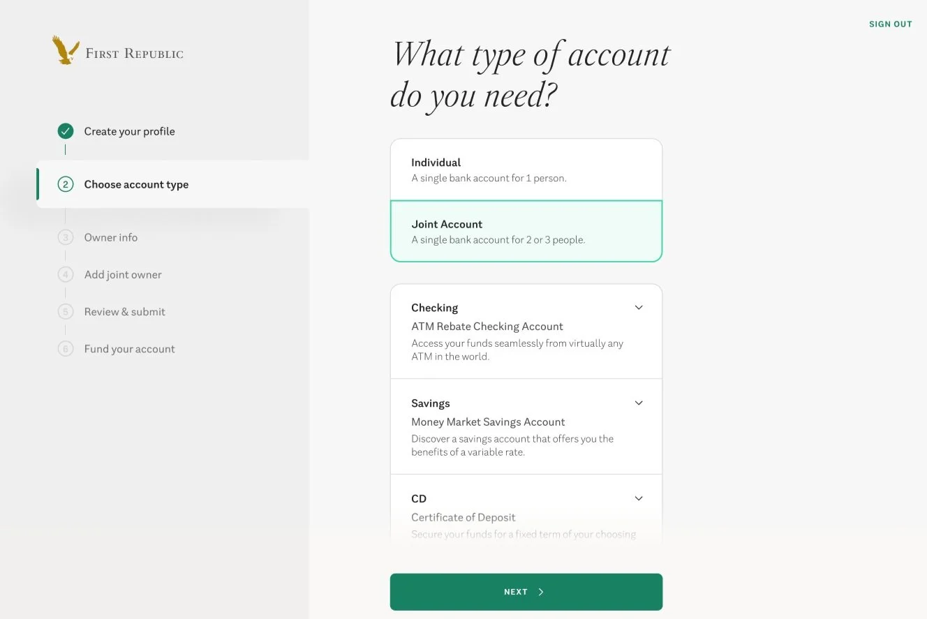
The (current) solution
Along with a fresh design (so long, Windows 95 clip art), we:
Created headings to make the account type clear (legal wouldn’t let me lose the names entirely, but I feel this was a decent compromise)
Hid the nitty-gritty account details while keeping a high-level description
Updated Accessible click-in to learn more details (arrow rather than using “View” or “See” language)
Updated copy per brand/UX guidelines
Added the ability to select joint/individual accounts
The result
No one ever dropped off again!
Jokes. Any application is at the whim of moments of hesitation or distraction and each page had some drop off. But this page’s drop-off rate decreased from 60% to 10%.
More highlights from the application redesign

These screens…

Became these screens.


This long form…

Got a modern update.

